Roles:
Research, Wireframing, Prototyping, Conducting Usability Studies, Accesibility, Visual &
Iterating Design
Project: Vortex Records App
Duration: May - Jul 2021
Project Vision
Challenges
Vortex Records App is an integral app for project managing, logistics and recording progress within the record label. It assists the artists, engineers and producer to facilitate the process of recording, editing, mixing and mastering. Moreover it helps reducing logistics and communication time between the artists and the staff in the record label.
1) Synchronize recording sessions and tasks.
2) Allow users to update recording sessions and members.
3) Internal visualizations for project progress


Kick Off
Starting off, I asked myself a few initial questions. Who is our primary user? What kind of goals do they have? Why would someone want to use this application? Just how large of a scope do I want this project to be? After interviewing forty-five participants to establish archetypes later on, it became evident that the goals they wanted to accomplish all fell within the same categories; organizing their time in the studio while being aware of the scope and progress of the project.


Preliminary Ideation
We used affinity mapping not only to identify the general scope of Vortex Records App, but to decide which direction we wanted to take the product. This was a way of brainstorming during our kickoff period that proved to be very helpful in setting up the foundation for the rest of our process.

Research Insights
We conducted a user questionnaire to gauge record-planning impact on artists in terms of convenience, as well as which part they played during the planning process itself. These are the highlights of the insights we discovered when working through the questionnaire results and feedback.


Meet the users
PRIMARY
Name: Carlos
Age: 45
Family: Single, lives alone
Occupation: Arranger
Name: Christian
Age: 40
Family: Married, lives with two children
Occupation: Engineer
SECONDARY


Carlos is a professional keyboard player and composer with a busy and demanding schedule. He works as a freelancer arranger. Carlos would like to organize his time to be more efficient in his recording sessions so that he can optimize his schedule and balance his work and personal life.
Christian is a percussion teacher and a professional drummer with a busy and demanding schedule. He works as a freelancer and loves to produce music with his band. Christian needs to easily organize his recording sessions, follow up the progress and being notified in one place so he doesn’t have to worry about missing important dates.
Key Path Scenarios
Most of the time, products tend to usually just have one primary key path scenario. However, we identified two key path scenarios when using Convene. One the user will experience as while planning an event or get-together, and the other when participating an event that the user didn't create themselves.
The scope of the product allowed us to focus more on these two pathways as there aren't any notable validation scenarios other than entering a familiar settings screen.

Creating a Framework
To better understand how we would construct the core experience for Vortex Records App, we designed a user flow. This helped us focus more on the experience and needs of the user and less so on the details that we would solidify later on. It also allowed us to communicate the entries and exits more clearly so we would have a better understanding moving forward.


Preliminary Wireframes
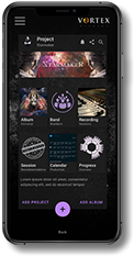
Creating a preliminary version of our wireframes, we were able to workout some of the technical issues that would not be viable in Vortex Records App. It was important for us to start big and scale down so that we could work around the features that we really wanted to have, rather than working upwards and maybe missing something that would've been really cool to see as a user.


Final Designs


Style Guide
Using warm feeling and comfortable colors, helped convey the feeling of comfort to our users in Live Wire. Shades of gray, red, and black are present almost everywhere throughout the world in some aspect, so it paired well with the idea of night clubs and venues coming from everywhere across the globe.. The main typeface of choice for the site is Avenir. I wanted to select a sans-serif typeface that would bode well with the rounded edges within our interface, as well as the black/white contrast inside of the app.
Colors
#231F20
#453C3
#635757
#9A8D8D
#C4C3C3
#4766B0
#FFFFFF
#D12D17

Type
13pt - Medium, Avenir
13pt - Bold, Avenir
20pt - Regular, Avenir
20pt - Bold, Avenir
24pt - Bold, Avenir
Buttons

Normal
Pressed
#D12D17
#9A2717
Logo

Takeaways
Live Wire made me realize just how difficult it can be to produce an application that complex. Even though I had much knowledge about music business coming into the project, it became problematic when designing around a few screens. Luckily, I acted as somewhat of a SME (Subject Matter Expert) and was able to guide the direction of my process. This made me realize just how important it is to have known A LOT about the subject of the app you are developing in order to create a well-rounded experience for both first-timers and veterans.
Reach out to me
contact@fariasfernando.com
Searching for a designer that shows
passion in their work? Interested in
working together? I'd love to hear from
you!
Copiright © 2023 Fernando Farías